Today, shoppers want more than just functional mobile apps—they crave beautifully designed, intuitive platforms that reflect the essence of the brand. With that in mind, I set out to create a fashion e-commerce app that not only makes shopping for clothes a breeze but also visually represents the style and identity of the brand.
While this app is still in its prototype phase, the goal was clear: to create a seamless, stylish, and personalized shopping experience for fashion lovers. This case study dives into the research, design process, and branding decisions that led to the final prototype.
Problem Statement
How do you balance beauty and functionality in a fashion app? When customers shop for clothes online, they’re not just looking for items — they’re looking for inspiration, a vibe, and a sense of identity. With so many fashion apps in the market, the challenge was to create a unique mobile app experience that reflects the brand’s identity while keeping the user journey smooth and enjoyable.
The challenge: Design a prototype for a fashion e-commerce app that’s visually stunning, easy to use, and allows users to discover, explore, and purchase fashion items without any friction.
Target Audience
The app is tailored for:
Fashion-conscious individuals: Young adults (ages 18-35) who stay up to date with fashion trends and expect their digital shopping experience to reflect the same.
Busy shoppers: People who want a fast, intuitive app that helps them find what they need quickly without too many steps.
Brand-loyal consumers: Shoppers who connect with specific fashion brands and want their experience to mirror the brand’s visual and emotional identity.
Research and Discovery
Competitive Analysis
Fashion is about more than just clothes — it’s about expression. So, I took a deep dive into some of the most popular fashion apps, such as ASOS, Zara, and H&M. My goal was to understand how they balance aesthetics and usability.
Key takeaways:
Immersive Visuals: Successful fashion apps feature high-quality images, bold layouts, and smooth transitions that showcase the products like they’re on a runway.
User-Centric Navigation: Simple, easy-to-access filters and categories.
Personalization: Many apps use past browsing behavior to make the shopping experience feel tailored, offering personalized recommendations or styling tips.
But I noticed that many fashion apps still missed the mark in a few areas: they often felt overwhelming, cluttered with promotions, or had a checkout process that was more complicated than necessary.
Brand Exploration
Since this project involved branding, I started with defining the essence of the fashion brand I was designing for. It was important that the app’s visual identity echoed the brand’s personality: modern, chic, and minimalistic—think neutral tones, sleek lines, and bold typography. The branding had to be sophisticated but approachable, reflecting a fashion-forward yet accessible vibe.
User Personas & Interviews
To ensure the app met the needs of real users, I created personas based on user interviews. I talked to a mix of fashion enthusiasts and casual shoppers to get a sense of what they love (and hate) about shopping for clothes online. Here’s what I learned:
Fashion Enthusiast: “I want an app that feels like it knows my style, suggests pieces I love, and shows me outfits in a stylish way, like flipping through a magazine.”
Busy Shopper: “I don’t have time to scroll through endless pages. Give me clean filters, clear images, and an easy checkout.”
Casual Shopper: “Sometimes I’m just browsing for inspiration, so the app needs to feel trendy and aesthetically pleasing, but without bombarding me with pop-ups or distractions.”
Design Process
Wireframes & User Flows
The first step was to create low-fidelity wireframes to map out the user journey. Fashion apps need to feel visually rich but easy to navigate, so I focused on designing a flow that:
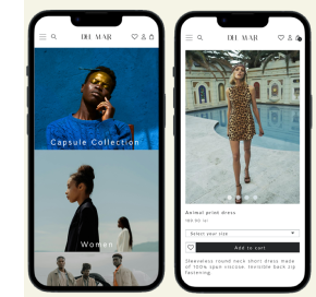
Home Screen: Featured a clean, curated layout showcasing trending styles, with clear navigation to shop categories like New Arrivals, Sales, and Top Picks.
Product Page: Big, bold images, with a “swipe through” feature to browse multiple angles of the clothing item, as well as easy-to-access size guides and reviews.
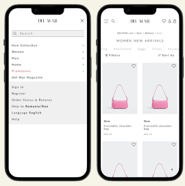
Search & Filter: Simple, intuitive filters based on size, color, and price, all accessed with one tap.
Checkout: A one-page checkout process, incorporating digital wallet payments (e.g., Apple Pay) to ensure minimal steps and maximum ease.
Branding in Design
Branding was central to this project, so I ensured that every screen in the app reflected the brand’s modern, chic identity:
Color Palette: Neutral tones (grays, whites, and soft beige) with a pop of accent color (e.g., soft blush pink or baby blue) to highlight call-to-action buttons like “Add to Cart” or “Buy Now.”
Typography: Clean, modern fonts that are readable but stylish, ensuring the fashion-forward vibe remains consistent throughout.
Imagery: Full-screen, high-resolution images with minimal distractions, letting the fashion items shine.
High-Fidelity Prototypes
Once the wireframes were validated with some quick feedback from users, I created high-fidelity prototypes. This is where the branding truly came to life:
Visual Experience: The app feels like flipping through a high-end fashion magazine—bold images of models wearing clothes, clear CTAs (calls to action), and smooth transitions.
Microinteractions: Subtle animations when adding items to the cart, hovering over products, or scrolling through collections, making the app feel dynamic and polished.
Product Display: Large, clear product photos with options to zoom in, view the item from different angles, and see “related outfits” suggested below.
User Testing
I conducted usability testing with 5 users who fit the target audience (fashion lovers and busy shoppers). Here’s what I found:
Positives: Users loved the minimalist design and large product images, making it easy to visualize the items. They also appreciated how quickly they could filter products by size, color, or price.
Improvements: A few users mentioned wanting more detailed product descriptions, so I plan to update the product pages to include fabric info, care instructions, and styling tips.
Reflection on Branding
This project was about more than just creating a functional app—it was about crafting an experience that resonates with the brand’s fashion-forward audience. The neutral tones, sleek typography, and full-screen imagery reflect a modern yet timeless brand. Every visual element was chosen to make users feel like they were not just shopping for clothes, but engaging with a lifestyle.
Lessons Learned
Working on this prototype emphasized the importance of balancing visual aesthetics with usability. While it’s easy to get caught up in making a fashion app “look good,” the user experience must remain simple, intuitive, and fast. I also realized the power of branding: how every color, font, and image can speak to the user’s emotional connection with the brand.
Next steps? Further refining the product pages based on additional feedback and exploring how AI could be used to personalize the shopping experience even more.